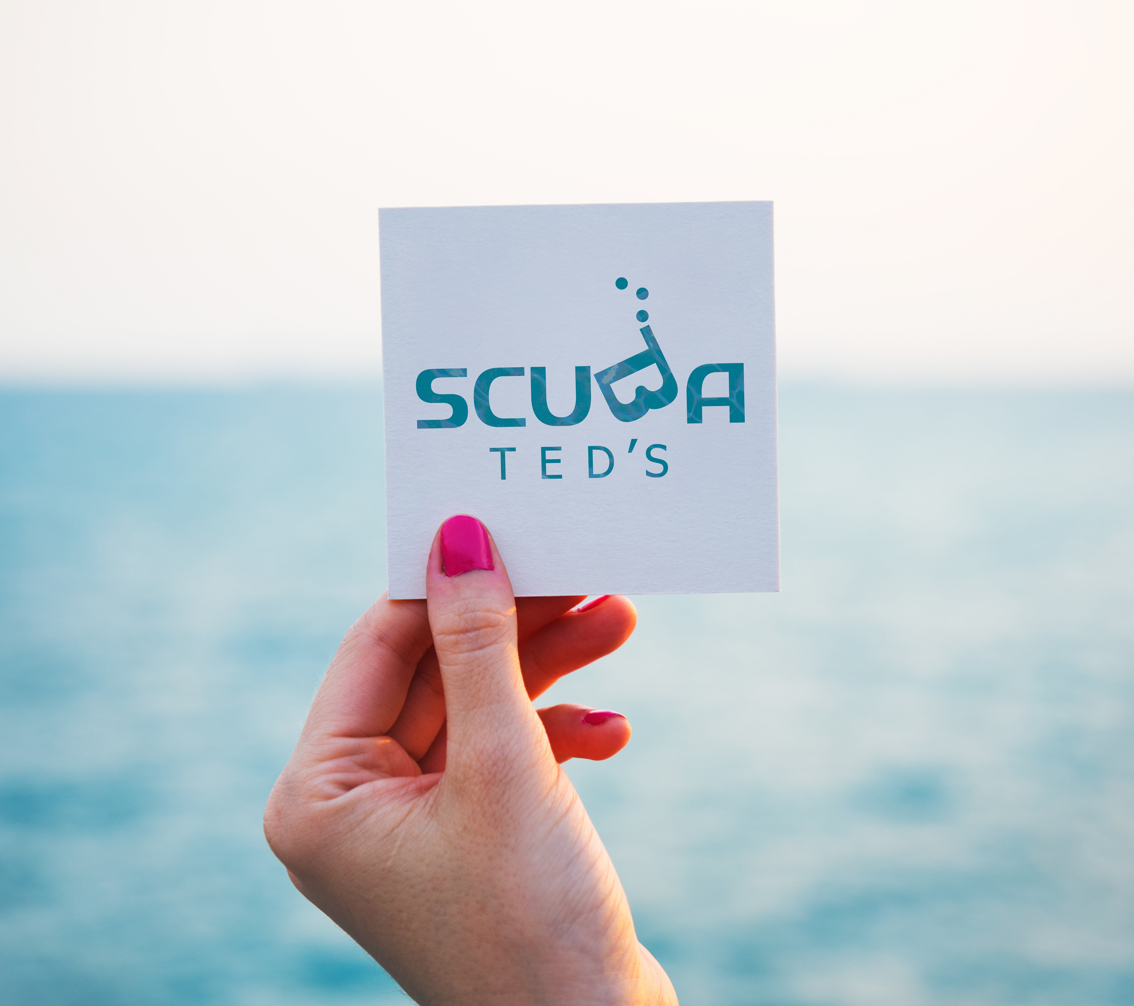
This project was to rework a current company logo with a custom wordmark. After researching possible options, I chose Scuba Ted's scuba supplies and certification shop.
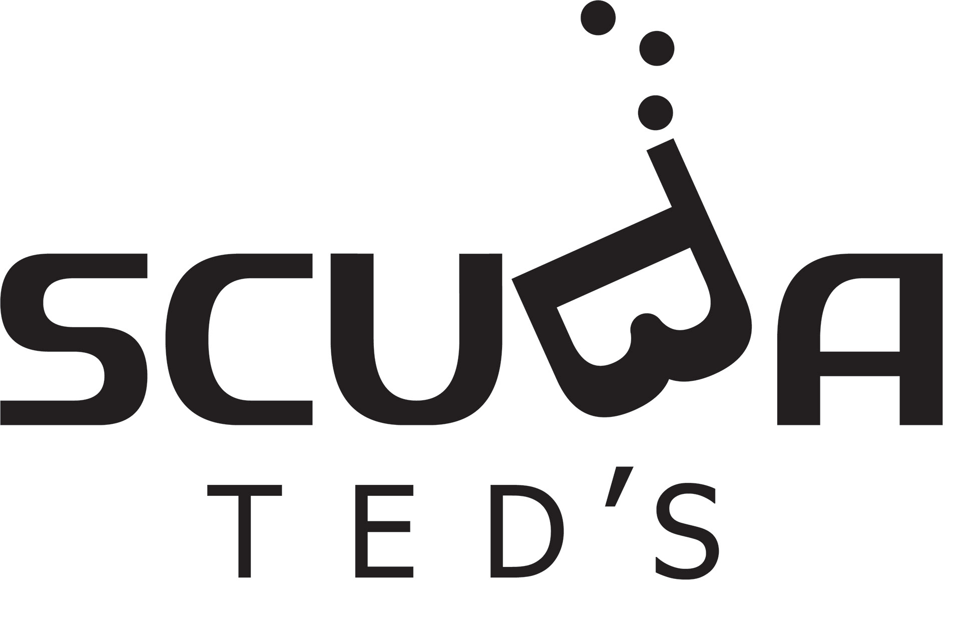
Incorporating the idea of the scuba mask, I rotated the B in the name forty five degrees and extended the letter form, changing the B to a simplified mask. I changed the original typeface originally used and thickened the type to a bold font giving a more professional feeling.
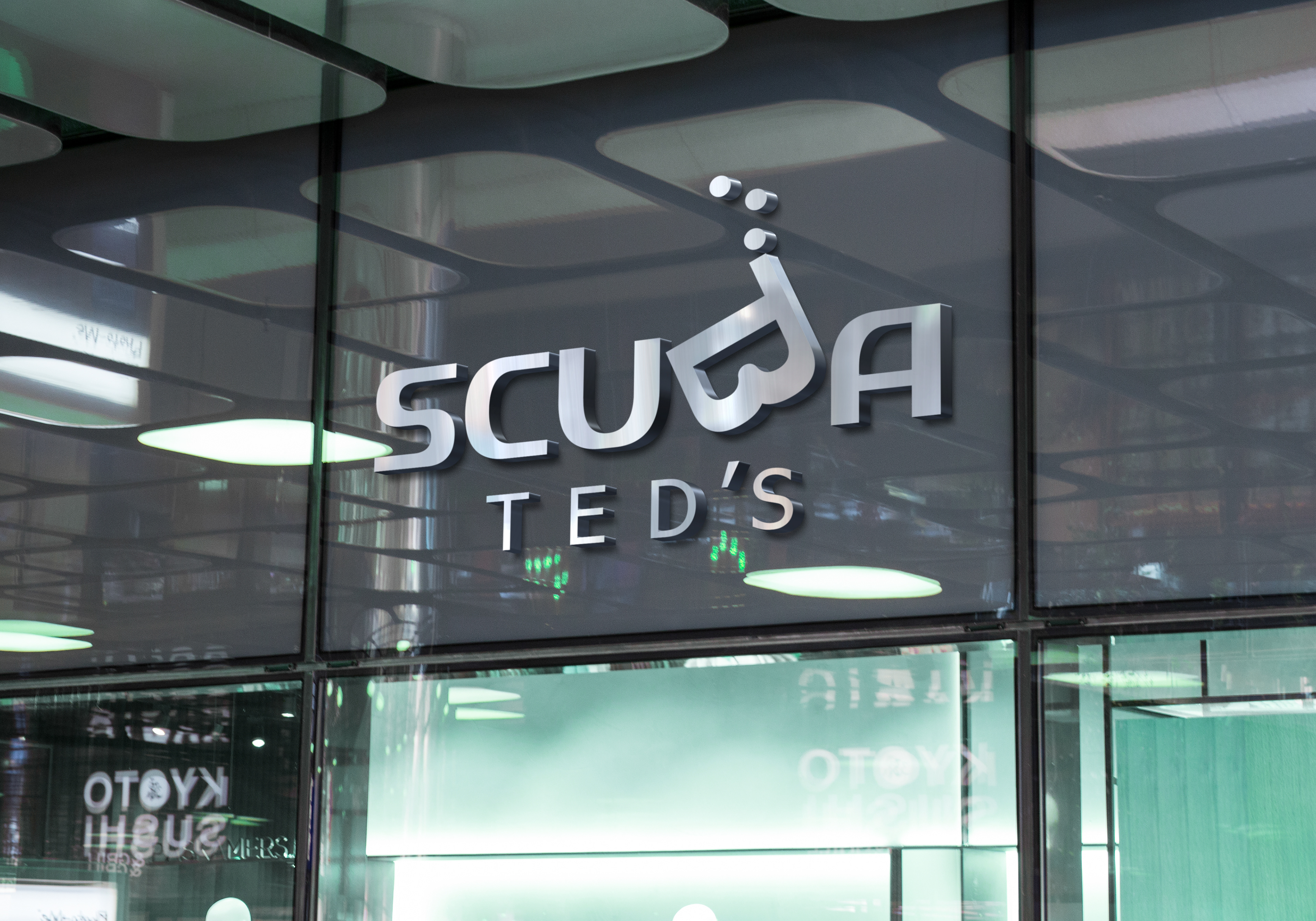
I finalized the design with three bubbles to give the illusion of the wordmark underwater.